Analyzing Your Presentation Performance with uPresenter’s Analytics Dashboard
An analytics dashboard is an indispensable tool in online training, offering valuable insights into learners’ performance. By analyzing feedback and responses, you can refine your training materials to enhance effectiveness and engagement. In this post, we’ll explore the key features of an analytics dashboard and how it can help you assess and optimize your presentation performance.
What is an Analytics Dashboard?
An analytics dashboard is a powerful tool that provides an in-depth overview of audience engagement with your presentations. It offers valuable insights into how viewers interact with your content and helps identify areas of high and low performance. Key metrics often featured in an analytics dashboard include:
- Engagement rates: Track how much time viewers spend on each slide or section, revealing levels of audience interest.
- Slide performance: Highlight the slides that captured the most attention versus those that were skipped or briefly viewed.
- Audience interaction: Measure engagement with interactive elements like polls, quizzes, or embedded multimedia, capturing real-time feedback.
- Drop-off points: Identify specific moments where viewers tend to lose interest or exit, helping refine content pacing and structure.
- Conversion metrics: Assess how effectively your presentation encourages desired actions, such as sign-ups, downloads, or clicks on embedded links.
- Demographic and device insights: Understand the types of devices your audience uses and gather demographic details like location or age group, when available.
Do We Need an Analytics Dashboard?
An analytics dashboard offers real-time insights and data that drive audience understanding, content optimization, and more engaging presentations. Here’s why an analytics dashboard is essential:
- Visualize data for better understanding: Gain detailed insights into audience demographics and engagement patterns. Understand who your audience is, what they value, and how they prefer to consume content, allowing you to tailor presentations effectively.
- Real-time data reporting: Access live metrics on viewer interactions, enabling immediate adjustments to maximize impact and engagement.
- Cloud-based accessibility: With cloud-based analytics, deploy and access data insights from anywhere, anytime, without the need for physical infrastructure.
- Data-driven decision making: Make informed adjustments to your content based on actual audience behavior rather than assumptions, refining your message to improve relevance and engagement.
- Enhanced engagement: Identify high-impact slides and topics to ensure future presentations focus on areas that resonate most with your audience.
- Time efficiency: Quickly spot less engaging content, enabling you to optimize or streamline presentations for greater impact without wasting time on ineffective elements.
- Clear ROI (Return on Invest) measurement: Quantify your presentation’s effectiveness, helping to justify the resources invested by showcasing its measurable impact.
- Continuous improvement: Establish a cycle of improvement, refining each presentation based on feedback and performance metrics to increase audience engagement over time.
In summary, an analytics dashboard transforms presentations from static content into strategic assets, enabling continuous refinement and maximizing their impact.
Explore the Analytics Dashboard in uPresenter
Stand out in a wide range of presentation makers, uPresenter offers an analytics dashboard with value metrics as on LMS. You can track viewers’ performance in real time.
To see the analytics dashboard, click this icon![]() at the top-right corner.
at the top-right corner.
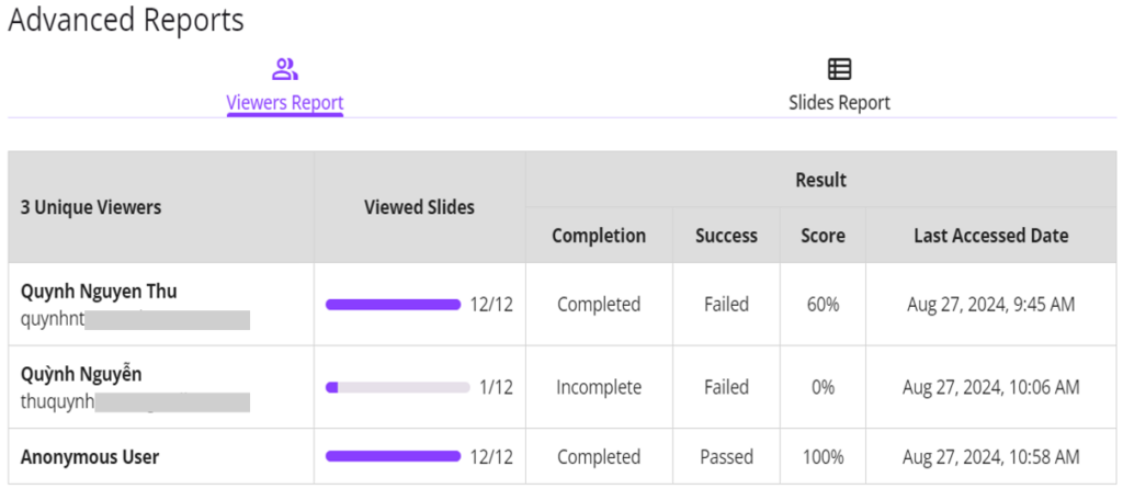
- Viewers Report: The overview report of learners including the number of viewed slides, completion status, pass/fail results, score and last access date.

Note: Anonymous User refers to a learner who viewed the presentation without logging in.
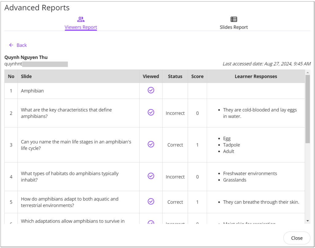
Click the learner name to see her detailed report like this:

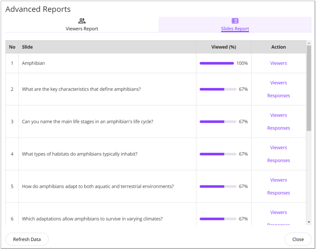
- Slides Report: Detailed reports for each slide, including the percentage of learners who viewed the selected slide.
- Viewers: Click to see who viewed the selected slides.
- Response: Click to see the percentage of learners choosing each answer option.

uPresenter’s analytics dashboard is more than just a tool—it’s your gateway to understanding and optimizing your presentations like never before. Offering in-depth insights into audience engagement and slide performance empowers you to create data-driven presentations that resonate with your viewers. Whether you’re looking to refine content or improve training quality, uPresenter equips you with everything you need to improve continuously.
Start leveraging the power of analytics today and transform your presentations into impactful experiences that truly connect with your audience. With uPresenter, every insight is an opportunity for growth.
See more:

