Top Presentation Design Trends in 2024
In 2024, the way we approach presentation design is evolving rapidly. With new technology and audience expectations at play, presenters are expected to deliver not just information but an experience. Whether you’re a professional speaker, educator, or business leader, staying up to date on the latest trends will help you captivate your audience and leave a lasting impression. In this blog, we’ll dive into the top presentation design trends of 2024 and how they can transform your slides into dynamic, engaging narratives.
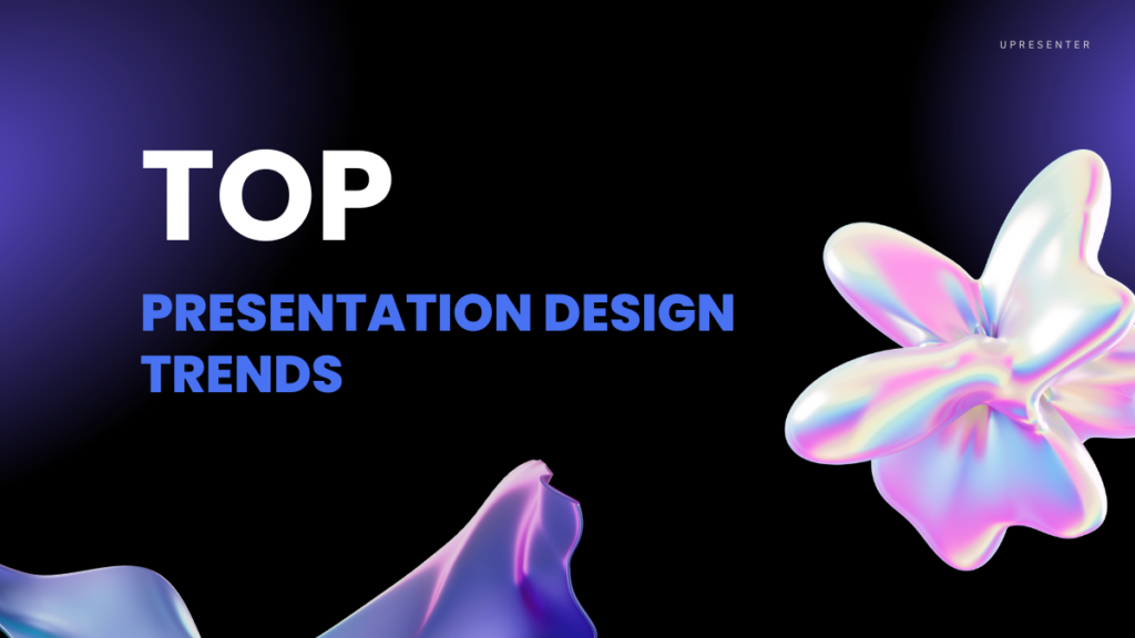
Presentation design trends in 2024 are evolving with a focus on technology, simplicity, and engaging storytelling. Here are some of the key trends to watch.
1. AI-Driven Design Assistance
Artificial intelligence (AI) is no longer a futuristic concept — it’s reshaping how we create presentations. Tool like uPresenter is leading the charge, offering AI-powered design assistance that allows users to build professional-grade slides in minutes. These tools not only automate layouts but also generate design suggestions based on the content, helping you streamline the creation process.

AI’s role doesn’t stop there. Personalization is a growing trend, and AI enables presenters to tailor content specifically to their audience. By leveraging data, you can automatically adjust elements like imagery, tone, and even data visualizations to better engage your viewers.
Tip: Embrace AI tools that provide real-time design recommendations and automatic adjustments to save time while enhancing your presentation’s quality.
2. Minimalist and Clean Design
The “less is more” philosophy is taking center stage in 2024. Minimalist design trends favor simplicity, emphasizing fewer elements per slide and creating a cleaner, more focused presentation. By cutting down on unnecessary visuals, audiences can focus on what really matters: your message.
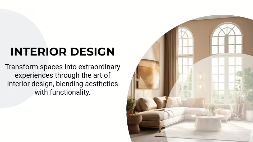
Whitespace, or negative space, is also making a comeback. It allows slides to breathe, reducing cognitive overload for the audience. When used effectively, whitespace highlights key points and makes your presentation feel uncluttered and organized.
Tip: Use fewer elements on each slide and embrace whitespace to let your message shine through clearly and confidently.
3. Bold Typography
Typography is no longer an afterthought — it’s a bold, central feature of modern presentation design. Oversized, eye-catching fonts are being used to emphasize key ideas, making slides more impactful and digestible at a glance.
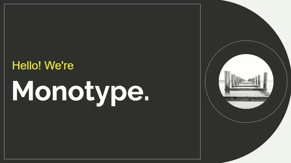
Custom typefaces are also gaining traction, helping brands maintain visual consistency and offering a unique look that stands out from the crowd. Whether you’re going for a sleek and modern font or something more creative, bold typography is a surefire way to make a statement.
Tip: Choose bold, clean fonts for headlines and key points to ensure readability and grab attention immediately.
4. Data Storytelling & Visualizations
Data is powerful, but raw numbers can be overwhelming. The trend of 2024 is all about transforming data into stories through visualizations. Presenters are using tools that allow real-time interaction with data, making it possible to adjust figures or explore different scenarios on the spot.

Dynamic infographics and animations help simplify complex data, making it easier to digest and visually appealing. Rather than static charts, think of using animated sequences to show progression or changes over time.
Tip: Use animated data visualizations and infographics to tell a story with your numbers, making the data both informative and engaging.
5. Dark Mode Presentations
Dark mode isn’t just for your phone or computer anymore — it’s now making waves in presentations. This design choice features a dark background paired with light text and vibrant accents, creating a sleek and modern look that’s easy on the eyes.

The high contrast that comes with dark mode ensures that key elements, like bold colors and text, stand out clearly. It’s not just about aesthetics either; dark mode can reduce eye strain, especially in dimly lit environments.
Tip: Try a dark background with neon or pastel highlights to create contrast and give your presentation a contemporary edge.
Conclusion
Presentation design trends in 2024 emphasize simplicity, interactivity, and storytelling. By adopting AI tools, using bold typography, incorporating data storytelling, and experimenting with immersive visuals, you can create a presentation that not only informs but captivates. As design continues to evolve, these trends will help you stay ahead of the curve and deliver impactful presentations that resonate with modern audiences.
See Also:

